Wednesday 1 December 2010

Today, while driving in my car i heard an advert on the radio for the urgent need for Blood Donors during the cold weather.

So, when i got back to the studio i tried to find some data on issue. To my surprise i couldn't find anything. This to me either means two things... Its not a huge issue, or nobody has chosen to show the data anywhere.

On the give blood website, you are however shown a pathetic graph, apparently showing the blood supply levels.


Stock Levels on December 3rd.

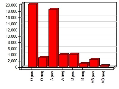
This is all the information supplied with the graph.

From this graph i understand that we have a lot of O+ and A+, and that we have little B- and AB-. However i don't understand if these levels are sufficient. Also, what do the number refer too?

What blood donors need to know is, how many more people are needed to fulfil this months blood donations quota, and can I be one of them.

So i propose this as a replacement...


In this graph, you are able to understand how many appointments are needed this month. If you know your blood type or not, you are able to realise the need, and sign up for an appointment.

This would be the monthly graph:


----------------------------------------------

Now I will try and do the same graph, using photography.

Friday 26 November 2010

So today i've managed to change my design process.

Up until yesterday i've been thinking that i've needed to find an interesting piece of information and represent it in an interesting fashion. However now i've realised that my design process has been all wrong.

Instead of choosing the information to study myself, i've decided to put the question out to other people. "what would you like me to help you learn about?"

So i've sent an email out to people who might like to help me. I tried to include a mixture of people I would consider as 'creatives' and people that i would consider as 'uncreative'.

--------------------------------------------------------------------

The emails really long but here it is anyway....

Hi All,


First of all i would like to say that this isn't just a viral message that i've sent to my whole address book, but each person has been carefully selected as i feel you may be able to contribute in different ways.

So as many of you know I am fast approach the end of my time at Goldsmiths. My final year evaluation will consist of one project, which will be displayed at the Final Year Show.

As I’ve brainstormed ideas for this project, I’ve found myself becoming increasingly interested in how human beings interpret data and how the visualization of data can impact that interpretation. You will all have come across data visualization, either in newspapers or on the internet. It is often used to represent large amounts of data in order to aide the understanding of the data’s relevance and meaning. An example of Data Visualization can be found at the link below. This is a diagram of the Irish Bailout package and how various countries have contributed.

Have you clicked on the link? Good. My immediate observation was that although this diagram may be interesting and well conceived, it doesn’t provide you with any knowledge of how it impacts your personal situation. It doesn’t enable the reader to emotionally engage with the topic at hand.

For my project I would like to visualize data that is local and very personal. Elements of every day life that, although not life changing, impact the way you go about your day. Relationships such as how many adverts you pass on the way to the supermarket and how they impact your buying behavior OR maybe something more personal such as what you eat in the evening and what time you poo in the morning.

Last week I produced a piece of Data Visualization to represent the number of people that displayed work in accordance with a deadline. I wanted the graphic to represent the class at the very moment of being viewed, meaning the data would be live and therefore more emotionally engaging for the students. I also chose to use a rather strange way of displaying the data, and as, I really did not know the results until the deadline had passed, I had to create 20 different versions to ensure that the correct one would be available. (please see attached image).

Now to the important part! I would like to ask for your help. More specifically I’d like you to task me to collect some form of data about your life. Have you ever wanted to find something out, but would never have the time to actually do it. Well this is your chance to ask me to do it for you.


I would design the process of collecting the information and then go about vizualisation the data. The possibilities for the end product are ENDLESS. It could be a 2D graphic, a 3D kinetic sculpture or even a piece of interactive software.

So please send your ideas to me and I can get to work selecting those I could best work with. I understand if your too busy to respond or cant think of anything for the time being.

I hope you are all well.

Love Danny. x


--------------------------------------------------------------------


Thursday 28 October 2010

So the other day we had to go away and find an image that we thought showed an idea well. It wasnt about the quality of the image but how it put its point across.

Matt did a little 5 minutes presentation to show us some of his findings that really helped me along with my project. He showed us an artist/designer/information designer who photographer images of multiple object that represented a certain fact of figure.

So for example, here is a piece that he did about prison. This image depicts 2.3 million folded prison uniforms, equal to the number of Americans incarcerated in 2005.


BOOOM, i found this really interesting. It was also a huge relief, as I've been looking for a way to incorporate photography into my project for some time. This helped me to realise that i really need to stop locking myself into corners and stop thinking i cant do things. I really need to broaden the way and collect and represent data.

Oh and you know your doing something right when you have a TED talk... so heres Chris Jordan's TED talk.


So this week we had to develop our projects through photography.

At first i found it pretty hard to conceptualise my thoughts into an image. I didn't just want to show my ideas through a constant representation of the same object. I wanted to represent a solid percentage about the people who will be viewing it. I also want to make the data more personal, find someway of involving the people who view it into the data.

So when we are asked to do a project like this, we always hang our work on the wall.


So i decided that i would do a chart about how many people presented work that day.
As i wouldn't be able to guess how many people would do the work, i would have to print of loads of chart amounts and mount the appropriate image that day.


So the left image is a diagram of the amount of people who handed in the work for today.
37 people turned up for class out of a possible 51, totalling 74 percent.

I wanted to say that, if this class was this man (well harry boy)'s chest hair then we would look ridiculous.

Click on the images to look a little closer.


Thursday 14 October 2010


So the other day i spent an afternoon riding the bus, my aim was to count the number of white people riding the 21 bus from New Cross Gate to Old Street compared to the black people.

So i did a few trips, and each time counted the number people getting on and off the bus. What i found was really interesting, click on the map to read the data i found.


Tuesday 12 October 2010


I think there can be a fine line between comedy and design. Both try to elaborate on the ordinary and make something new from it. Dimitri Martine does a great job in visualising funny pieces of information, and its the simplicity that makes it so effective.

Monday 11 October 2010


So this is a video I watched a little while ago, i found it allot more interesting when i first watched it then now.

Today in college we did our first workshop on our ideas for our projects. I talked about how i wanted to base my project on different ways of understanding data. I think it would be fascinating to transform data in to a form that is easier for visually impaired people to read. Maybe something physical that can be touched or heard.

I read an article today about how blind people precept beauty and how even tho they cant appreciate somebodies appearance, they still ask their friends if the person is good looking before considering dating them. One girl explained that "beauty to her is when you can experience something with all senses." So even tho this lady had lost her sight, her appreciation for an attribute only recognised with something she didn't have, is still really important to her.

The article was from a beglian magazine called THE WORD. Find the article on their online magazine by clicking here, its on page 65.

So after a good day of research and thinking about possible paths to take my project, i've decided to change it a little.

I now think that i would like to base my project on unusual links between two completely different types of information or data.

I posted about this earlier on, but i think it would be fascinating to find really awkward correlations between two completely abstract pieces of data. I also fancy adding a bit of humour to the project... Im working on it!

Sunday 10 October 2010

I hate bloggers. I've always found it really interesting how people can be self obsessed enough to write a blog about themselves. Im all for people showing their work on their blogs and i think its a really good way to get your work shown. However when it gets to the point where your constantly writing about yourself, then i find it all a bit strange.

If found some really horrible blogs in the past, from some incredibly vain people...

Heres one i find really funny, he updates his flickr about 3 times an hour, and some comments are outrageous.

http://twitter.com/bryanboy

http://www.bryanboy.com/

However maybe its impossible to not get caught up in it, as this is suppose to be a blog about my ideas and inspiration for my 3rd year but has ended up in me posting my own work in some places. I wonder what it is about the possibly of some people reading what you have to say that makes you go all self obsessive...

Hey why dont you check out my website..? Umlautcollective.com
The Golden Hour is a name given to the first and last hour of sunlight in the day. Allot of photographer use this hour to create beautiful golden images.

Here is some by Antonella Arismendi


Heres one i found quite funny,


And here are some of mine,


I spend allot of time trawling flickr, in fact its pretty much the main exposure i have to the world of photography. I sometimes feel quite embarrassed as people try to talk to me about their favourite photographers and I never know who there talking about. I also try and relate them to people i've seen on Flickr. It doesnt go down so well cause i dont think flickr is seen as a place for real photographers to display work...
One of my favourite portrait photographers is this guy called Benoit.P. The mood in his Images and use of DOP is iiiiinncredible. I also really respect the way he meets his subjects. He walks around paris looking for interesting people, instead of taking pictures of these people secretly he approaches them and talks to them. This is something that i find so hard to do and respect him so much for doing. I really want to know what things he says to these people and how he gets them to pose for him. He must be such a nice and interesting person to be able to get these people to trust him. Ive taking pictures of people, but never have enough confidence to approach somebody interesting looking. How do you start that conversation? Do you talk about something completely different first? Do you hide the camera so they don't get scared of you. I guess all these things change depending on who it is and how confident they are.

I went to the park a little while ago to take some pictures of people and ask their opinions on a project i was doing, I found it so hard to talk to people and ended up talking to only 3 people. I took their pictures but they turned out shit cause i was nervous about it. I think its something i need practise on.

I really want to do a project on chefs in alleyways smoking a cigarette. I think it would make really nice pictures. I would need to talk to people and probably have to walk around london for a while to find some.

Benoid's Approach to photography:

Questioning the modern world in which we are living and trying to break this individualism and the anonymity of the big city. By going into “Non-lieux” (no existing places) (subways, malls, and crowded streets at rush hours …;) and by talking to people to take photos, I break the usual way this modern world works for a few instants. I make real these “non-lieux” by creating an event that the stranger will remember.

Hes also offers workshops, maybe we could get him down to goldmiths?

Here are some images by Benoid.P:


So im quiet a tidy person, i cant work in my room unless its tidy and i reckon this comes through in my projects... I find it hard to hand in a piece of work that i'm not 100% happy with. However in my second year at Goldsmiths I had to present allot of work that i wasn't pleased with.
So anyway... I live with 5 other people in my house, and there are allot of things that really get on my nerves. Now i don't want to come across as a sicko so i don't always tell them that it annoys me, but heres a list of things that really annoy me in my house...

Tea Towels not getting hung up...


Pint glasses getting left for weeks in rooms...


The bath mat getting left on the floor after a shower...


Toilet paper not getting put on the ring thingy...


Anything of anybody else's getting left in my room, especially coffee mugs...


washing up getting left in the sink and not on the side...

The water from the washing up still left in the sink...

The soap from the water from the washing up still left in the sink...

I love the people i live with and really enjoy living with so many people, but i'm looking forward to down sizing next year.

I bet in the next the few days ill be able to take pictures of these things....


So sometimes 2 things come together, completely unrelated, but form something so amazing that there no point me writing any more on it, you just have to watch it...


Or watch it on youtube
I've recently been taking alot of photographs for the Deptford Project.
It all started when i did a little work for a studio down there called Jail-Make and things just escalated from there. I love the vibe of the place and their attitude towards fresh and local produce being sold in their cafe. They have a range of workshops in the arches behind the train where a bike studio called Union Cycle Works has just opened. Cathedral Group asked me to take some images for their website. You can see the pictures here...

Getting stuck into a project like this one has been amazing, feeling a part of something good makes being constantly busy really enjoyable. Its made me realise that maybe this year can be more than getting a good grade. Of course its important to tick the boxes, but what else can i do with my project...?


click on the image to see the rest


Thursday 7 October 2010

In my last post i commented on how I wanted to make an object that balanced two relating peices of information to give you a stronger truth. Well what if i compared two completly diffrent pieces of information, such as...

Time spend looking at porn...
Size in weight of hair on body...

Surely that would be more interesting!

Or maybe find some interesting correlation between:

People falling over...
Bananas eaten...

Curries sold in restaurant on the road...
Packets of gum sold in shops on the road...

Weetos sold...
Dvds of Back to the Future sold...


Wednesday 6 October 2010

How we consume information

Half way through my 2nd year of Goldsmiths, i had the idea to base my 3rd year project around how we understand information. I've always been interested in how easily people can be fooled by facts and statistics. If something is take out of context it comes across as a completely different piece of information.
Now its not the idea of fooling people that interests me, its the possibility of a change in how we read the information that i find interesting.
For example, if you were to read that qatar was the largest consumer of gas power per habitant, you would think down on the country. However if you were to also read that they were also the largest exporter of Gas per habitant, it would be easier to understand that its not due to the populations over use of gas, but due to its easy access to the material. They are also the 76th highest consumer of oil compared to britain 13th position out of a total 208, and don't have any oil imports.

Id like to create a type of kinetic sculpture that balances different pieces of related information to give you a better idea of the truth. How and with what, i don't know...